

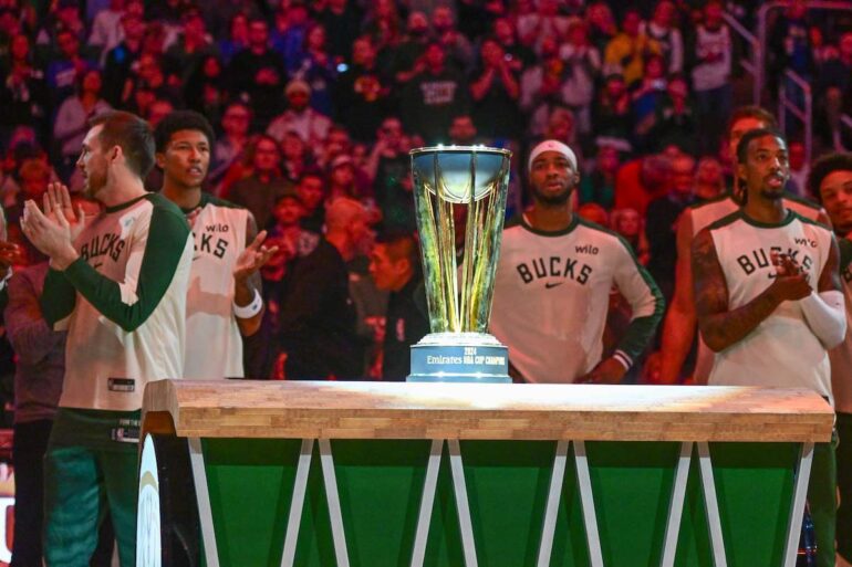
The Emirates NBA Cup courts keep getting better. For the third run of the NBA’s new early season fixtures, the league shifted from big colorful bars in year one to circles in year two to mosaic, grid-like courts in year three.
These aren’t all perfect but the direction seems to be improving. And for the second year in a row, we’ll rank all 30 new NBA Cup courts, in what has become my favorite annual piece to write. As usual, these rankings are primarily based on my subjective opinion but I’ll attempt to maintain some level of consistency. These rankings, which we’ll split into tiers, encompass the courts’ design, color scheme and any other hidden details. You can take a look at all 30 courts here:
All 30 courts for the 2025 NBA Cup. pic.twitter.com/BAHoIeuxQ8
— Chris Haynes (@ChrisBHaynes) October 24, 2025
At this point, we have three years of court designs. For the first time, I’ll consider if/how the color schemes and designs have evolved or adapted and will include last year’s court ranking in parentheses. Since we have a second year of data, let’s discuss some broad trends before diving into the rankings.
- The courts overall toned down the saturation and gigantic center court logos, which benefited some and hurt others.
- As I alluded to, the courts overall are higher quality than last season and the season before. The bottom two tiers include six courts compared to 11 last season. The top two tiers contain 16 courts compared to 11 last season.
- The biggest risers from last season are Detroit (plus-11), Miami (plus-19) and Utah (plus-19). The biggest fallers are Chicago (minus-12), Dallas (minus-11) and the Lakers (minus-11)
- I don’t like gray courts
These Will Hurt To Look At
- New Orleans Pelicans (25)
Just as I wrote last season, I’m generally not a fan of these extremely deep blue courts with giant, distracting logos.
Sneak peak of our alternate court for the Pelicans Cup games presented by @MorrisBartLLC pic.twitter.com/I8GXCe6B35
— New Orleans Pelicans (@PelicansNBA) October 24, 2025
- Oklahoma City Thunder (28)
This court is way, way too deep blue with another logo a bit too big. I enjoy the orange outline here but I wish Oklahoma City went with a lighter shade of blue.
Introducing our 2025 NBA Cup court 🖌️ pic.twitter.com/m9v2JPnyj3
— OKC THUNDER (@okcthunder) October 24, 2025
- Denver Nuggets (27)
Despite coming in at 28th, I like this court better than last year’s bright yellow edition. Something about those colors in conjunction with each other just doesn’t work for me but I can imagine this ranking being unpopular.
First look at The Cup court 👀 pic.twitter.com/qFHhSlM8OT
— Denver Nuggets (@nuggets) October 24, 2025
Why Is It So Gray?
- Golden State Warriors (24)
Golden State has too much source material to work with to continue to roll out these drab, gray floors.
NBA Cup court alert 💙
Our home games will be played on our new fully painted court throughout the tournament as your @warriors fight for the trophy pic.twitter.com/j05nRwsXjq
— Chase Center (@ChaseCenter) October 24, 2025
- Sacramento Kings (22)
This isn’t a terrible court or anything but for a Kings franchise with some of the best existing colors (royal purple, baby blue, deep red) in its palette, this is underwhelming.
A look at the court the Sacramento Kings will play on during NBA Cup games played in Sacramento this season. pic.twitter.com/zsBLS4R8Ho
— Sean Cunningham (@SeanCunningham) October 24, 2025
- Memphis Grizzlies (21)
I actually like this court better than last year’s, incorporating the lines on the baseline into the court, but the field this season is much stronger. Gray won’t cut it!
👀 First look at our @NBA Cup Court, debuting 10.31 😮💨
🎟️ https://t.co/2I6BAXfgP8 pic.twitter.com/3ZEYYa1sHo
— Memphis Grizzlies (@memgrizz) October 24, 2025
- Chicago Bulls (11)
The Bulls, after fielding a nice, deep red court last season, joined the morass of gray-for-no-reason courts. It’s admittedly the nicest of the tier — I especially like the center-court logo and Chicago flag stars — but the Bulls have so many better colors from which to pick.
First look at the Bulls' NBA Cup Court 👀
What do you think? 🤔 pic.twitter.com/LGmKZDRBuL
— Bulls on CHSN (@CHSN_Bulls) October 24, 2025
Inoffensive, Could Be Better, Could Be Worse
- San Antonio Spurs (18)
San Antonio avoids the gray tier, since it’s a primary black and white team anyway. Still, I yearn for the year the Spurs base their court around the fiesta color scheme.
The @spurs new court for the Emirates NBA Cup pic.twitter.com/wTWil70MZK
— NBA (@NBA) October 24, 2025
- Los Angeles Clippers (13)
I’m docking points for the Clippers’ gigantic, ugly logo and the “Make Waves” slogan at the bottom. I’m sorry, it just does not work.
👀 #ClipperNation https://t.co/BQgSRkNw42 pic.twitter.com/OecU3FPDDr
— LA Clippers (@LAClippers) October 24, 2025
- Brooklyn Nets (19)
Brooklyn ran back effectively the same court as last season, swapping a Nets logo for the Brooklyn lettering at center court. The gray fits the Nets’ brand and the subway Helvetica adds a nice touch but there’s more potential here to unlock. I’m sure of it.
Love this court for the NBA Cup this season, feels like 2019 vibes pic.twitter.com/BxAZfSHrv8
— SleeperNets (@SleeperNets) October 24, 2025
- Atlanta Hawks (29)
It’s a much-needed upgrade from last season’s highlighter yellow court. The deep red contrasts nicely with the gold NBA Cups and the Hawks logo strewn across the top of the court adds some visual interest without being too distracting.
Introducing this season's NBA Cup court 🔴
Be in the building when it debuts on November 7: https://t.co/MH4f4vZ4Vq pic.twitter.com/4Z4MgtYiWQ
— Atlanta Hawks (@ATLHawks) October 24, 2025
- Detroit Pistons (30)
While this court isn’t anything special, it’s a massive upgrade on the comically large, thoughtlessly placed designs of last season. A lesson in simplicity.
First look at this year’s @NBA Cup court 🔥
Detroit Pistons Cup Nights presented by @Xfinity pic.twitter.com/maffhuoczz
— Detroit Pistons (@DetroitPistons) October 24, 2025
- Los Angeles Lakers (7)
The Lakers were one of a few teams to abandon the bottom-court skyline design from last season and lose points because of it. They’re also one of the few teams where the more saturated yellow just works better.
Our NBA Cup Court 😎 pic.twitter.com/mOlA6GfWZZ
— Los Angeles Lakers (@Lakers) October 24, 2025
A Nice Change Of Pace
- Indiana Pacers (15)
I’m partial to the Slick Leonard “BOOM BABY” reference, even if the text is a bit large for my taste. The bright yellow exterior and muted, dark blue court look great together.
the @NBA Cup is back and so is our Boom Baby court 💙🔥 pic.twitter.com/hd3ASWNYkD
— Indiana Pacers (@Pacers) October 24, 2025
- Orlando Magic (20)
Despite keeping the gray theme, the Magic did enough to bump their 2025 NBA Cup court up a tier. They improved the baseline fonts, added some intrigue to the out of bounds with the color shift and the center-court logo is cleaner. Fair enough, Orlando, though I still wish it were less gray.
our official @NBA Cup court 🏆
first NBA Cup night:
🗓️: Nov. 7
🆚: Boston Celtics
🕖: 7 PM
📺: @FanDuelSN_FL
→ https://t.co/fCrzi2ksZw pic.twitter.com/xKJZM8qpEm— Orlando Magic (@OrlandoMagic) October 24, 2025
- Houston Rockets (17)
Like many other teams did, the Rockets upgraded on an already solid formula. The white lines look even cleaner on the less-saturated red court.
First look at our NBA Cup Court 👀
Cup action tips off in Houston on Nov. 14 vs the Blazers! pic.twitter.com/jXyRvmmmo3
— Houston Rockets (@HoustonRockets) October 24, 2025
- Toronto Raptors (3)
It’s a solid court with nice colors and detailing but where is the Raptors’ purple? The prehistoric theming? I worry the court may look too busy with players on it but Toronto’s color scheme carries its ranking, even if I’m unhappy with this relative to expectation.
The Raptors NBA Cup court for this season: pic.twitter.com/f5C9teStt4
— Esfandiar Baraheni (@JustEsBaraheni) October 24, 2025
- Dallas Mavericks (2)
I’m extremely disappointed in Dallas for abandoning the skyline at the bottom of last year’s court. I like that shade of blue enough to keep this court highly ranked but this should have been better.
Here’s a look at the Dallas Mavericks’ court for the 2025 NBA Cup.
Dallas is in Group B with the LA Clippers, Los Angeles Lakers, Memphis Grizzlies and New Orleans Pelicans.
This court will likely be used at the American Airlines Center on 11-14 vs LA and 11-21 vs New Orleans. pic.twitter.com/K0NEOZy2S0
— Noah Weber (@noahweber00) October 24, 2025
- Cleveland Cavaliers (10)
This is effectively a repeat of last year’s court, with the same universal changes as the rest. Cleveland has an excellent color scheme and deployed it logically here.
Our court for the Cup!
Kenda Tire | #LetEmKnow pic.twitter.com/pKeKgISEXb
— Cleveland Cavaliers (@cavs) October 24, 2025
- Minnesota Timberwolves (14)
Minnesota kept the tree line at the bottom of the court and it looks even better this year with the updated shade of green.
our NBA Cup court. 🏆 pic.twitter.com/g2fZFCfzBe
— Minnesota Timberwolves (@Timberwolves) October 24, 2025
- Phoenix Suns (16)
Phoenix’s more salmon-y orange compared to last season’s court meshes nicely with the black background, making for a pleasant viewing experience. I wish it had incorporated purple somewhere but this is a strong court.
Our 2025 Emirates NBA Cup Court ☄️ pic.twitter.com/Y9FuuTSVYl
— Phoenix Suns (@Suns) October 24, 2025
- Washington Wizards (12)
Here’s a rare court upgraded by turning up the saturation (and balancing out the colors) on the floor. The hand and basketball logo blends even more smoothly than last year’s. I love this one.
Our @NBA Cup Court just dropped 👀
🏀 See it in action starting Nov. 7th!
🎟️: https://t.co/YzNiX5dLxp pic.twitter.com/6B1tCImDSj— Washington Wizards (@WashWizards) October 24, 2025
- Philadelphia 76ers (8)
The only major change here (aside from the universal ones) is swapping blue for red on the out-of-bounds areas and it improved the court. It’s a pretty court to look at and is fitting for one of the NBA’s most storied franchises.
our @NBA Cup court. 🔥 pic.twitter.com/oETe2g10cK
— Philadelphia 76ers (@sixers) October 24, 2025
- Miami Heat (26)
No team benefited from desaturating its court as much as Miami, which turns a bright yellow eyesore into much more pleasant shades of yellow and orange. Those sunset-reminiscent colors make much more sense with Miami’s brand and it meshes with the deep red nicely.
New chase for the NBA Cup… New court to play for it on…
Get your tickets for our NBA Cup games inside the @KaseyaCenter and we'll give you the chance to take a photo on this floor! Deal? ➡️ https://t.co/ewirdYGcfE pic.twitter.com/LBcgmhrK44
— Miami HEAT (@MiamiHEAT) October 24, 2025
- Milwaukee Bucks (5)
While I’m slightly disappointed the Bucks ditched their secondary blue, their primary shade of forest green looks excellent here. The green might mesh with the sideline details even better than the blue did previously.
New season. New NBA Cup court. 🏆 pic.twitter.com/8YctbOhwZe
— Milwaukee Bucks (@Bucks) October 24, 2025
Let’s Make These The Default Courts
- Portland Trail Blazers (4)
It’s gray for an amazing reason.
From concept to court, the NBA Cup design has arrived.
Our NBA Cup court is set to debut Oct 31st against the Nuggets at the @ModaCenter. pic.twitter.com/r9XKSww9Ah
— Portland Trail Blazers (@trailblazers) October 24, 2025
- Utah Jazz (23)
I’m unreasonably excited the Jazz were the only team to graduate from the gray tier last season, returning to form with their trademark royal purple. It’s a stunning court.
♒️ 𝗠𝗘𝗘𝗧 𝗧𝗛𝗘 𝗖𝗢𝗨𝗥𝗧 ♒️ for our 2025 NBA Cup games 🏔️#TakeNote | @seatgeek pic.twitter.com/tbb3UFuSXb
— Utah Jazz (@utahjazz) October 24, 2025
- Boston Celtics (8)
This is a strict upgrade on last year’s court. The deep green is a beautiful backdrop and the mosaic style benefits Boston as much as any other team. Look at all those lovely shades of green! I love it enough to bump it up a tier from last season.
A fresh take on the parquet ☘️ pic.twitter.com/GYK7ZKB0t6
— Boston Celtics (@celtics) October 24, 2025
- New York Knicks (6)
New York earns the second spot almost solely because it’s the only team to keep the skyline on its NBA Cup. It was such a unique feature for cities with iconic vistas and, for some reason, only the Knicks realized it. Swapping bright orange for a beautiful deep blue vaults this court over the top.
First look at the Knicks NBA Cup Court
Do we like it? pic.twitter.com/Eyf0o2V5LU
— Knicks Memes (@KnicksMemes) October 24, 2025
- Charlotte Hornets (1)
I really tried to pick another court to top this list but there wasn’t any other legitimate option. The Hornets improved on the top-ranked court last season, refining the teal and blue honeycombed floor. This is one of my all-time favorite NBA courts.
the official stage of our home nba cup games 👀
presented by @BankofAmerica pic.twitter.com/mZke3vvzEY
— Charlotte Hornets (@hornets) October 24, 2025