NBA
The Chicago Bulls Logo Is Older Than the Moon Landing; Here’s Why It’s Never Changed

The Bulls are one of the most successful NBA franchises, with the most of their success coming in the ’90s when Michael Jordan led the team to six championships. With the team making so many deep playoff runs during that period, the Bulls logo has become an iconic image.
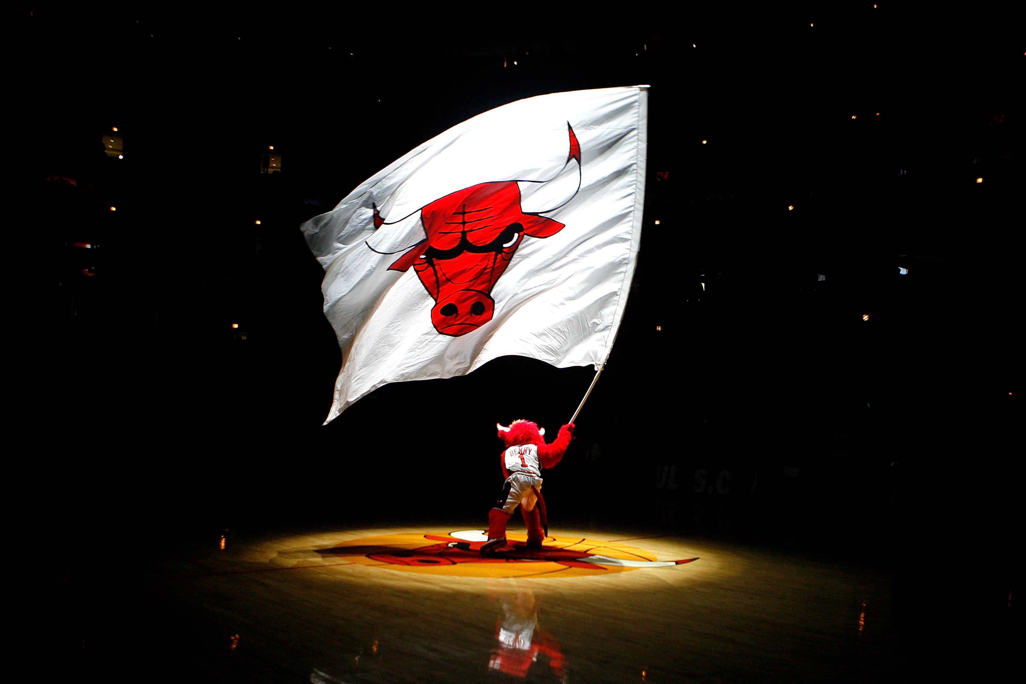
One notable fact about the Bulls logo that most people don’t know is that it’s the only NBA team logo that’s never changed. It’s so old it was even created before the moon landing in 1969. Here’s why it’s remained the same for decades.
Chicago Bulls’ franchise history
RELATED: Michael Jordan Did Fear One Player on the Basketball Court
The Bulls joined the NBA in the 1966-67 season, going 33-48 their first year in the NBA. It took five seasons before the team earned its first winning record, going 51-31 in 1970-71. The franchise’s first division title came in 1974-75 campaign. This was the Bulls’ only division title until 1990-91, when Jordan came into his prime and led the team to its first NBA title.
The Bulls won titles in the next two seasons, as well. Jordan led them to a second three-peat starting with the 1995-96 season. To date, the 1997-98 championship remains the franchise’s last. Overall, the team has a 2,227-2,135 record with 35 playoff appearances resulting in those six titles.
The design of the Chicago Bulls logo

Fast Company provides some info about the design of the famous Bulls branding, including a mystery surrounding its origin. The publication notes that there are several theories and anecdotes about the logo’s design, but no one who was interviewed for the article was completely sure about the true story. In fact, two designers are credited with coming up with the everlasting design.
A 2004 Chicago Tribune obituary of commercial designer Dean Wessel was the brains behind the logo. The story goes that Wessel designed the image as a favor his friend, Bulls founder Dick Klein, in exchange for free tickets. In a 1993 interview, Wessel recalled showing Klein the logo for the first time. The team owner told the designer he wants “blood on the horns.”
Another designer, Ted Drake, was credited in obituaries upon his death in 2000 as having come up with the design when he was working for Wilson Sporting Goods.
Chicago sports historian Jack Silverstein theorizes that Wessel and Drake may have possibly worked together on the logo. The accounts crediting each man were overlapping and seemed independent of each other. In his opinion, though, Silverstein thinks “Wessel is the designer, and Drake is a mystery.” Both designers have passed away. So the true answer may never be uncovered.
The staying power of the logo
RELATED: Michael Jordan Has 7 Fewer Gold Medals Than Another 1984 Bulls Draft Pick
The Bulls confirmed to Fast Company that they still use the original 1966 logo. They are the only franchise to never change its logo. And people, including Silverstein, believe the staying power of the logo has nothing to do with the design itself but rather with Jordan.
The former Tar Heel leading the team to dynasty status in the ’90s cemented that image in people’s heads — whether Bulls fans or not — and the team decided it made sense to continue using the branding, even after Jordan left.
The red bull has become synonymous with the team. It’s sort of like how a blue star is synonymous with the Dallas Cowboys, And the interlocking NY and blue pinstripes are associated with the Yankees. NBA consultant Ced Funches says, regarding the Bulls, “To rebrand would be to rewrite the legend” of Jordan and the ’90s Bulls dynasty. In other words, don’t fix what isn’t broken.


